WIX
Internal tool
Plazma
Rebuilding how engineers, product, and identity teams manage access. A ground up redesign of Wix’s internal permissions management tool.

ROLE
CONTRIBUTION
TEAM
Solo Product Designer
(end-to-end)
User research, hierarchy redesign, IA, full flows & prototype.
FED, BED, 1 PM & stakeholders
Summary
The Permission Catalog is the internal tool Wix employees rely on to create and manage the thousands of roles, scopes, and permissions that run the platform. Its broken, confusing UX had become a real liability; PMs and developers were filing dozens of support tickets a week, teams were getting blocked, and the resulting bugs were reaching actual customers. I redesigned it from the ground up to fix these issues at their source.
Impact
17%
Reduction in support tickets in first 30 days.
Positive feedback
Positive feedback on the system from dozens of devs and PMs.
20+
Devs and PMs have ditched Excel for managing workflows.
CONTEXT
Roles and Permissions
Most Wix sites are run by more than one person, owners invite collaborators (designers, developers, partners) and give each a role that defines exactly what they can touch. Those roles are built from a simple chain: a permission is the right to perform one specific action, like "edit inventory," straight from the code; permissions bundle into scopes (grouped by job function); and scopes combine into the roles people are actually assigned to.

WHO IT'S FOR
One tool, a wide range of technical fluency
The tool had to serve three audiences at once; from engineers fluent in the code to product managers who understand the business but not the API plumbing. It couldn't assume deep technical knowledge, yet it couldn't oversimplify for the people who needed real precision either

RESEARCH & INSIGHT
The workarounds told the whole story
I interviewed product managers and engineers across verticals, and was surprised to hear developers managing their permissions from Excel sheets.
01
"I don't have any way to know what the impact of a change is on other roles."
— Product manager
02
"I can't see who changed which role or scope, so I document every change manually, offline."
— Product manager
03
"Comparing roles means manually copying and pasting every scope. There's no built-in way to see the difference."
— Product manager
04
"We have no way to compare the granularity of roles, so all of it is maintained in an Excel file."
— Developer
05
"When I'm creating permissions, I don't even know the meaning of the attributes and fields."
— Developer
CURRENT TOOL
A control tower for permissions that nobody could see into before.
Wix's internal permission system had grown into a nested, undocumented maze. Teams couldn't see what they owned, couldn't trace who changed what, and couldn't safely delete anything. As lead designer I owned the problem framing, the information architecture, and the end-to-end UX for a platform built on the following principles: API-centric truth, clear ownership, and full visibility.

Technical constraints & requirements
🪆
Nested Complexity (the russian doll)
Roles contain scopes, and scopes are groups of permissions, stacked into many layers of hierarchy that were deeply nested even 8 layers down. We couldn't fix this messy architecture without months of dev work, so we had to design around these deep UX challenges.
🙈
Blindness
The nested hierarchy made managing any vertical a nearly impossible task. Changes were made blindly, opening real security gaps, no one knew who had changed what, or why. Adding or removing a scope became a real liability that hurt the UX.
🧟
Zombie Data
Permissions lived on long after their code was deleted. Nobody had a safe way to identify or remove them, so dead access piled up indefinitely, making an already messy system even worst.
.jpeg)
Current users relied heavily on permissions and scopes within their domain, but found the search area not intuitive and hard to use.
The navigation placed Permissions, Scopes and Roles as seperate entities and not as a structural heirachy. This led to confusion as to how permissions were built.
The FAQ took up a disproportionately large part of the page and wasn't valuable.

Managing 10,000+ permissions was almost impossible. It was extremely difficult to see which permission were used by which verticals, and what they were connected to.
.jpeg)
Clicking into a permission, scope or role was challenging to understand. Nested scopes could lead you down a trail layers deep.
THE CHALLENGE
Designing for intent
After understanding the user needs and technical requirements of the system, I moved to thinking about product strategy. How might we simplify a complex user system so everyone could use it? When researching the target users, I noticed a pattern. They were going into the tool for two main intents: Create a permission, and explore their domains.
My assumption was intent should drive the experience.


Users mostly wanted to see permissions in their domains.

Research and competitors
Permission management was not one I was familiar with, so I did an extensive UX research and competitor analysis.

Concepts and prototypes
I started by building black and white concepts to test with the team and internally, the faster we validate, the faster we could move.

01
The first concept was inspired by
google drive and dropbox on how to
manage large data sets. This approach required drill-ins and breadcrumbs.
02
The concept of tabs allowed for full visibility and the ability to see roles, scopes and permissions across an entire vertical at once.
⭐️ WINNING CONCEPT


03
The nested tree concept main goal is to show how scopes and permissions are nested, similar to other technical platforms were built, but tested to be too complex when I prototyped it with real data.


USE CASE O1
Viewing a role, scope or permission
Users need to drill down into a scope or permission in order to either edit, view relationships and other important information.
01
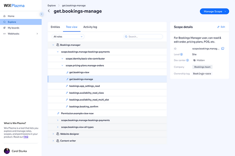
Tree view allows users to see where this scope or permission is nested within the system. Critical for understanding which permissions impact which roles.
02
Activity log is another critical component of this experience. Seeing what changes happened to an entity prevents breaking changes in the system (see features below).
03
From within a role/scope, I can drill down into nested permissions while seeing the breadcrumbs above so I never get lost.
Users can manage scopes assuming they are under the same ownership tag as a scope or permission. This ensures teams can only edit their own permissions
04


USE CASE O2
Tree view
A tree view displays hierarchical data as expandable, collapsible branches, letting you drill into nested items one level at a time. Here it maps the Role → Scope → Permission chain: expand a role to see the scopes it's built from, then a scope to see its permissions, making those relationships visible at a glance instead of buried and invisible.
USE CASE 03
Agile development
Halfway through development, the team made a breakthrough in how permissions were to be made, directly in the Proto and not in the UI of Plazma. This enabled the Proto to be the source of truth and help prevent critical errors in the code. This changed the panel button from 'edit' to 'view full details', as any changes were now in the code and not here.


USE CASE 04
Impact summary
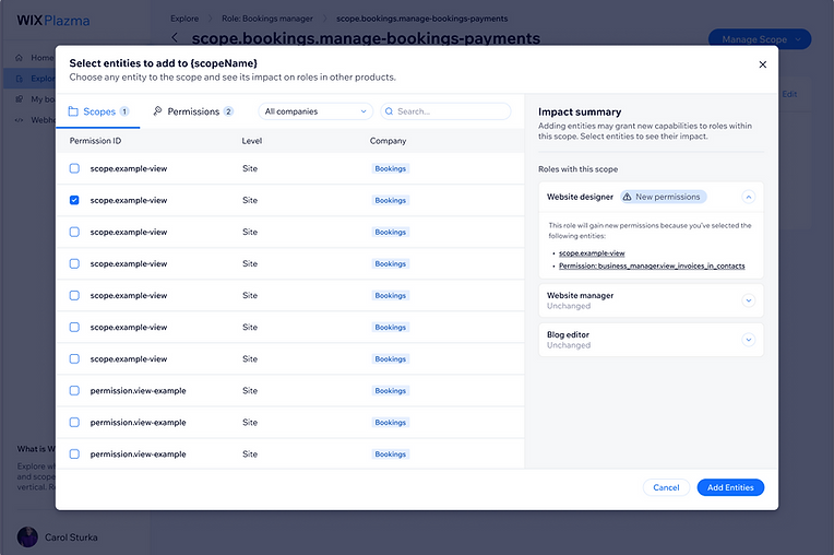
A key difference from the old permission manager is that Plazma lets you both add and remove scopes and permissions on an existing scope, and preview the impact before committing. The impact summary shows exactly which roles a change will affect, so edits are deliberate instead of blind. And because access can finally be removed, it solves the long-standing "zombie permissions" problem, dead permissions that lingered for years and were a major source of complaints from internal teams.
01
In Plazma, a scope or permission can exist in many roles. The way a website designer, and website manager may share responsibilities. So when starting to edit a scope, we see which roles are currently using this scope.
02
When selecting a scope to add, we see which roles will be impacted by this selection. In this example we see Website Designer will receive new permissions, a crucial piece of information that did not exist in the old permission management system.
03
If a user wants to further understand the impact of a change they will make, be it remove or add a scope, they can click on the name and in a new tab it will highlight that entity in the Tree view.


INSIGHTS & REFLECTIONS
Feedback and wins
🏆
Positive feedback
Plazma launched to a wave of positive feedback. These changes may look obvious now, but they were deceptively complex, and they fixed problems that had frustrated internal teams and end users alike for years. The result? Support tickets fell 17%.
⏰
Weeks not months
The expectation was completion in months. We did it in weeks, and surprised everyone. In part due to AI, our fast moving team and me taking part in QA fixes in Cursor. I pushed PRs so we could move faster, and we did.
🔮
Design with the future in mind
Not only were we able to tackle a complex system and make it usable, we did it with future designs in mind. The vision being a flattened hierarchy, no more scopes inside of scopes. This design makes scaling easy.